
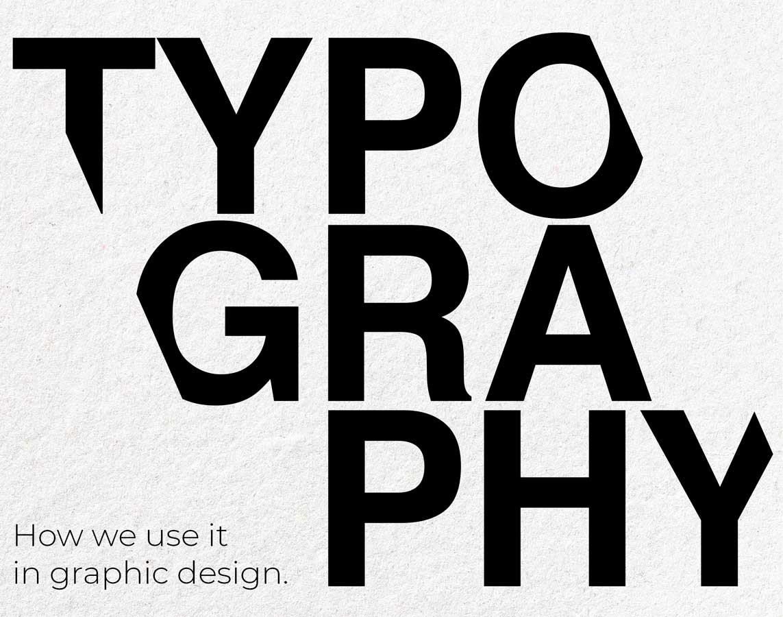
How we use typography in Graphic Design.
Topic Introduction
Using typography in graphic design will significantly impact how intended audiences receive, understand and act on the calls to action in print and digital content. Something as simple as the extra strokes of a serif font carry unspoken communication that subliminally invokes either logical interpretations or emotional reactions.
Visual communication offers marketers a way to steer the narrative of a piece of communication. Often brands become immediately recognisable because of their distinctive typographical style. Choosing suitable typefaces is a necessary building block that supports a brand’s personality, unmistakably communicates a theme and works functionally as per the communication piece. Chosen fonts must be flexible and easily applied to cross-channel communications.
We can’t stress enough how using thoughtful typography elevates projects. It’s a key identity design element that requires careful consideration, cultural understanding, design application and skill to create compelling artwork.
Design Basics of Typography
Typography refers to the style and arrangement of lettering in graphic design. Plus, the selection of an appropriate typeface for any given project. We choose typefaces for legibility, unique character style and its family of different weights and widths. Often we use two or three different fonts in a communication piece. We do this to support information hierarchy, positioning and what’s culturally appropriate for the message context.
Typography is arranged according to sans serif or serif font classifications. Serif fonts have extra strokes, whereas sans serifs do not have any such additions or embellishments. Both styles have their unique characteristics, begging for thoughtful consideration.
Font choice is only part of the typographical conundrum. We also pay close attention to kerning, tracking, point size and the importance of a competent visual text hierarchy.
Kerning refers to how close or far apart two characters are on a page. Tracking is similar but applies to the entire typeface. Leading is the amount of vertical space between lines of text. Point size refers to the relative size of typefaces in a design project. Visual hierarchy is the organisation of type in order of importance so that viewers know what to focus on. Sounds simple enough in theory but not always so easy in application when client supplies too much text or is vague with their messaging.
Choosing Fonts
Our designers select typefaces after considering the purpose and tone of a project intended for a specific target audience. Some design projects allow us to exercise free will over our choice. Other projects require us to work with specified brand typography to keep brand assets consistent across a marketing campaign. That’s why it’s essential we take time to understand the brief before opening up Adobe Creative Suite.
Depending on the theme or the type of media involved with a campaign, we will choose typefaces based on legibility and accessibility. Knowing who we are designing for is always at the forefront of our minds. For example, when working with organisations with an older audience, we take care to ensure typefaces are dementia friendly, easily read and legible in both print and digital media.
In contrast, when we design educational learning packs, we often opt for flowing, fun fonts that encapsulate the theme of the learning materials. Recognising the context and tone in which the artwork sits allows our designers to make professional choices that produce appropriate and compelling creative.
Understanding the art and science of typography is crucial to incorporate different typefaces into one design. We choose complementary fonts for greater diversity and to make our artwork visually appealing. We pay attention to type size, spacing and uniformity to maintain balance when laying our text to achieve maximum readability.
When choosing fonts, it’s also important to understand licensing implications. When creating a new brand identity system for example, we have to consider the cost-implications of font pairings. Some type foundries release typefaces for free but many still have to be paid for. Stand out fonts are beautiful but a licence to use them can be expensive. Therefore, we always check whether our preferred typefaces can be fully licensed for our intended use. We relay back the cost and any licensing terms to our clients. Depending on budgets and other factors, we stick with our choice or reconsider if need be. This crucial check should never be skipped.
Exploring the History of Typography
When choosing new typefaces, we research the thousands of fonts at our disposal. Using an inkling of an idea, we explore the history of a typeface we are interested in using to uncover its origins and cultural significance. The use of typography has been used for thousands of years from the first punches and dies used to create seals and imprints on currency. The first movable type was invented in North Korea in the twelfth century. Then Gutenberg’s invention of the printing press in the fifteenth century allowed type artists to develop the arrangement of type.
Now, the use of typography is broad. For us as a design agency, it extends to letter or character design and it’s application, typesetting, type design, laying out an hierarchy of information and usability across cross channel media. It can also be extended out to the realms of calligraphy and inscription.
Understanding the nuances between classical typography – from ancient inscriptions to modern type – underpins our typeface choices. Understanding how a particular typeface was and is now used often guides out thinking. Along with audience nuances and cultural considerations. After all, the creation of good artwork, not only has to look good and be legible. It also has to mean something to the person looking at it. Typography is a vital tool that allows us to communicate messages with meaning on behalf of our clients.