
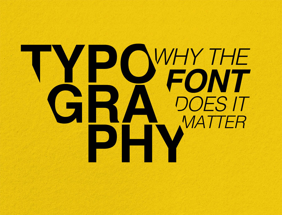
We at Brand Jam are big fans of typography. Used correctly it can really enhance your designs. Used badly, it will turn a well intended customer touch point into a liability which can damage your brand.
The correct use of typography is really important. If it wasn’t true, big brands wouldn’t pay type agencies huge sums of money to create a special typeface for their high-visibility brand. Typography is a core building block of your brand identity and needs to be treated with love and respect.
For this chinwag, it’s important we note the difference in meaning for the words ‘font’ and ‘typeface’.
A ‘font’ is defined as a given alphabet and its associated characters in a single size. It would include all of the letterforms, punctuation marks, numerals and metrics of a single type design. For example, 8pt Arial Light is one font. 8pt Arial Bold is another.
The word ‘typeface’, on the other hand, describes the overall aesthetic design of the lettering. Usually, a typeface is a complete collection of all the character elements (fonts) that share the same design characteristics.
So, with up to 260,000 typefaces in existence, how do you choose the right one for your brand.
First, know that typography is both a science and an art
You have to be disciplined in your approach to typography to ensure you get the technical aspects just right. For example, primary and secondary typefaces must work together in harmony and consistently throughout one document.
If you have brand guidelines, instructions of how to do this will be clearly laid out for you to follow. Here, your brand designers will have asked you to use one or two typeface families consistently across both online platforms and offline printed material, and in accordance with your brand values.
You also need to believe that typography is an art. By this, we mean that you need to visually see how a typeface choice can alter the context of your messaging.
Don’t see type as just words on your screen or a piece of paper. It’s more more than that. The right typographic treatment can turn simple words into a meaningful statement and convey an idea as a powerful visual metaphor. Typography is beautiful and the intricate detail of letterform can breathe life into any piece of graphic design.
If you have free rein to choose your preferred typeface, below are some questions that you can ask yourself to ensure you see typography as a science and an art form. Remember, the aim of typography is to make life easy for your audience. It should make your piece of communication easy to read and understandable whilst being attractive, engaging and meaningful.
A good choice is a typeface which gives a skilled designer the ability to produce an aesthetically pleasing and orderly page of text that doesn’t put any strain on the eye. Remember, legibility focuses on the clarity of individual letters while readability is the level of comprehension and visual comfort readers will feel when reading the words on the piece of communication you are producing.
You will need to think whether your typeface needs to be web and mobile-friendly or appropriate for print. If you are a visitor attraction, you may want to consider whether your type is dementia friendly and relevant for a variety of age ranges.
There are thousands of different typefaces for you to choose from. They all have unique characteristics and will give the words on a page a unique look and meaning. We touched on this when we talked about typography being an artform. We can’t stress enough the importance of selecting the most relevant and appropriate typeface for your message. These examples should help clarify the point…

Also, don’t be tempted to use too many font families or go too wild with colour. Some contrast can help make the text easier to read but the wrong use of colour can do more harm than good. If what you are doing does nothing to enhance the meaning of your message, then don’t do it. Finally, you need to feel confident you are using font families that go well together in terms of your heading, body copy and supporting features.
Brand managers and creative agencies go to great lengths to make sure the typeface chosen as part of their brand identity is truly reflective of their brand values. Are you sincere, exciting, competent, sophisticated or rugged? Whatever personality your brand has, your chosen typeface needs to reflect this tone of voice appropriately so that you can create a memorable and familiar connection with your readers.
Choosing the right typeface is one of the core visual elements involved in creating your brand identity. In order to use typefaces and their associated font families commercially, you need to purchase a licence for use. Many people aren’t aware of this and can accidentally land themselves in hot water with font foundry’s and type designers.
Some typefaces are available as freebies but not all.
In most cases, you will be asked to pay a fee to licence for commercial use. Once paid, you will be able to download your chosen typeface. Instructions of how you can use the typeface along with your rights and obligations will be laid out in the ‘End User Agreement’. Make sure you read this carefully so you fully understand what you can and can’t do commercially.
Ultimately, you are breaking the law if you borrow a ‘licenced’ typeface and it’s font family without paying for it.
When we brand and rebrand clients, the cost of a typeface is an important consideration. We will buy it for our use as a design agency, and then our client also has to purchase it for use in their organisation if they adopt it as part of their brand identity.
Buying the typeface once does not give everyone free reign to use the typeface. Therefore, it is imperative we look at licensing laws and their impact on use.
These are just a few simple considerations. As branding specialists, we will examine many more issues when selecting typefaces and font families. Why? Because typography is a vital building block when creating the right visual identity for any organisation.
Our advice for business owners
If you are trying to design your own marketing materials, it’s really important to pause and ponder the questions above before you settle on a favourite typeface (or one that’s suggested to you by automated software).
Know the psychology behind choosing a Serif font over Sans Serif or a handwriting font in favour of a display one, and then know what context to use them in. Also, be aware that you are not placing too many typeface combinations together in one piece of design. It has to be well balanced. And, watch your use of capitalisation. Your readers probably don’t want to be shouted at throughout the whole document.
Our advice for marketers and communication professionals
If you are tasked with creating marketing communications for your organisation, give your designers opportunities to use your corporate and supporting fonts in complementary ways.
Your designated corporate font is most likely going to feel very business-like which is entirely appropriate for organisation-led pieces of communication such as financial reports, signwriting on vehicle livery and internal messages.
However, there will be instances where the messaging used in your marketing may benefit from a move away from the sole use of your corporate font.
At these times, make sure the secondary font is complimentary and works to enhance the message. For example, a visitor attraction advertising a children’s activity may use the primary (corporate font) in the footer areas to display key information (address, telephone, charity number) but a more playful typeface and font family for headlines and body copy to make it appeal to a younger audience.
We do, however, feel it is always imperative to use your corporate (primary) font in all creative to maintain familiarity and heighten brand awareness. It becomes the golden thead that ties all of your marketing initiatives together nicely.
Final thoughts
All in all, there are no hard and fast rules regarding typeface use. It is open to interpretation. Whatever you need to produce, the typographic treatment you choose to use will play a vital role in building your brand. Don’t leave it to chance. This visual language is just as important as your logo.
If you would like some help with your typography, Chris is a great man to ask. He really enjoys this element of brand identity and will happily talk to you about any issues you may have.
Examples of typographic work created by Brand Jam
Always a pleasure to work with the Brand Jam team. They have a wealth of experience and creativity which shines through in the concepts that they create and how well they communicate them to the client. I’ve no doubt that we’ll be working with Brand Jam on many more projects in the future and wouldn’t hesitate to recommend them. See this real review here.
Tom Hardy, Operations Director, Hardy Signs